
Team
Kiran Kumar (Designer)
Lakshmi (Product Manager)
Keerthana, Arjith, Ganesh (Developers)
Timeline & Status

Pickyto consistently maintained above 4.2 ⭐ ratings in both the Play Store and App Store.

Project Goals
To provide a seamless experience for people ordering in busy food courts.
To digitize the entire ordering journey, allowing users to spend more time enjoying their food rather than waiting or spending time ordering it.

After getting insights from the research we began to design the app. Once the interface and prototype were ready, I took it for testing with my team to get their feedback and their perspectives on the design. We had a short duration to complete the app because we had a client waiting for this amazing product. We completed the entire design and an MVP version of the actual product within 60 days.

To Restaurant owners
How much money and customers do you lose during peak times?
How much time does it take to make an order and deliver it to the customer?
Do you get confused with orders and deliver the wrong order to the customers?
Do you run any offers to promote your restaurant?
What are the problems you generally face throughout the day as a shop owner?

To Customers
Do you skip the restaurant if you see a long queue?
How long will you wait before you leave the queue?
What do you do if you order multiple items from multiple restaurants?
Are you happy with the food prices or do you like to get more discounts and offers from the restaurants?
Do you prefer to come down to the food court every day, or would you like to get the food delivered to your desk?
Customer Insights
After talking with restaurant owners and customers, and a short survey we took, we had a clear idea of all the pain points they faced. Despite the amount of generated data from the interviews, this was the most relevant information for decision-making in creating the solution:

Desk Research
In addition to the above user research process, I researched the current market situation to see what other competitors' were present and what they did.
According to the National Restaurant Association, 61% of consumers say that they would order delivery from a table service restaurant if the service was offered.
QSR Web found that digital restaurant ordering is growing 300 percent faster than dine-in traffic.
Direct Competitors
Hunger box
Indirect Competitors
Pos like petpooja, Gofrugal, Limetray, etc.,
Food delivery app’s like Zomato, Swiggy, etc.,
Problem Statement
For Restaurant Owners:
Losing many customers due to high crowd in peak hours.
Losing 20 - 25k in revenue per week when customers skip the restaurant because of long queues.
Delivering wrong orders to customers In peak hours.
Since it's a faced paced environment no opportunity to upsell more items.
Losing a set of customer base who doesn't come to food courts.
For Customers:
Waiting for a long time in the queue to buy food.
Very hard to order items from multiple restaurants. Since a person has to go to each restaurant to make an order.
Very hard to track the order. Because they have to go and check with the restaurant to know if the food is ready or not.
There are no offers or discounts most of the time in the food court.
Waste 15 - 20 mins daily just to make an order.
Proposed Solution
For Restaurant Owners:
No more delivering wrong orders as a digital copy will be present with the user name and OTP.
Can Prioritize and process the orders faster, avoiding all the confusion.
Ability to Promote their restaurant's best sellers and run offers more evidently now.
Getting a wide range of new customers since the delivery option is available now.
Ability to sell more items by upselling them on the cart page.
Having less crowd in front of the restaurant because of fast ordering service.
For Customers:
Skip the long waiting queues.
Can order food from the office and by the time when they reach the food court, food will be ready already.
Order from multiple restaurants in a single order.
Don't have to keep a check on the restaurant to know if the order got ready or not. They can just go and pick up the food after getting a notification in the app.
Can try out new dishes, go for the best sellers and offers listed out.
Since all the dishes are listed in the digital menu with the photos and descriptions. They can see and know what they are ordering.
Can save time by getting the food delivered to their office desk directly.
How is Pickyto different?
Multi-store ordering in one go retains the actual food-court ordering experience.
Hyper-local Delivery inside the tech park. Enabling the employees to order ahead and get food delivered to their office.
Scan the QR code in the restaurant to order food or pick up the order.
These were some of the features no other company had done at that time.!
Information Architecture & User Flows
We thought about the best and easiest way for users to onboard themselves > find restaurants > and place orders. We designed it making sure it feels straightforward and logical while also being ready for future growth.

User flow to place an order

Other Flows

Sketchs / Wireframes


Wireframes


Final Designs


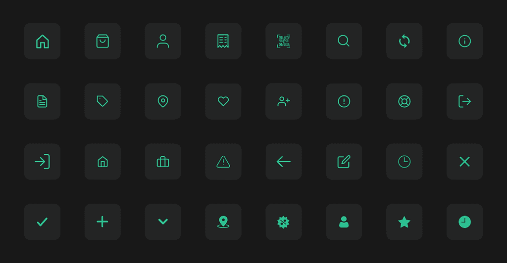
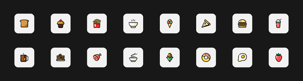
Visual Language


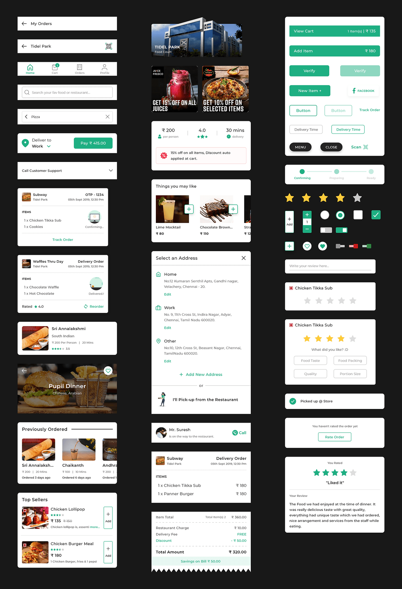
Partner Apps
We had a Partner app and Delivery app for our restaurant managers and delivery executives.
Partner App for restaurants allows them to add & edit products, manage orders, see reports, and much more.
Delivery App allowed the delivery executives to accept orders, contact customers, and track their progress throughout the day.
a small glimpse of those app designs :


Conclusion
Pickyto was a great product with a mission to save time for people working in huge IT Parks. It's packed with powerful features like Multi Restaurant order, Hyperlocal delivery, Self-pickup, etc.
We completed the product design and an MVP product within 60 days. Pickyto was launched successfully at Ascendas Tech Park in Chennai by onboarding all the restaurants in it. It was a good start for us as many people loved the app's concept and started using it.
I visited the Food court monthly once to get direct feedback from the users and restaurant owners. I spent 2 mins with each user to ask them for any improvements or issues in the app. We kept iterating and improving the app by considering usability tests, A/B tests, and other in-depth surveys with the user to improve the initial version.
Achievements
1000+ App downloads within 2 weeks of launch.
Launched in 5 more IT parks within a month.
Processed 5000+ orders in the first month of launch.
Pickyto was selected as one of the top 9 startups in the Dubai Smart City Accelerator.
Consistently maintained above 4.3⭐rating in both the App & Play Store.